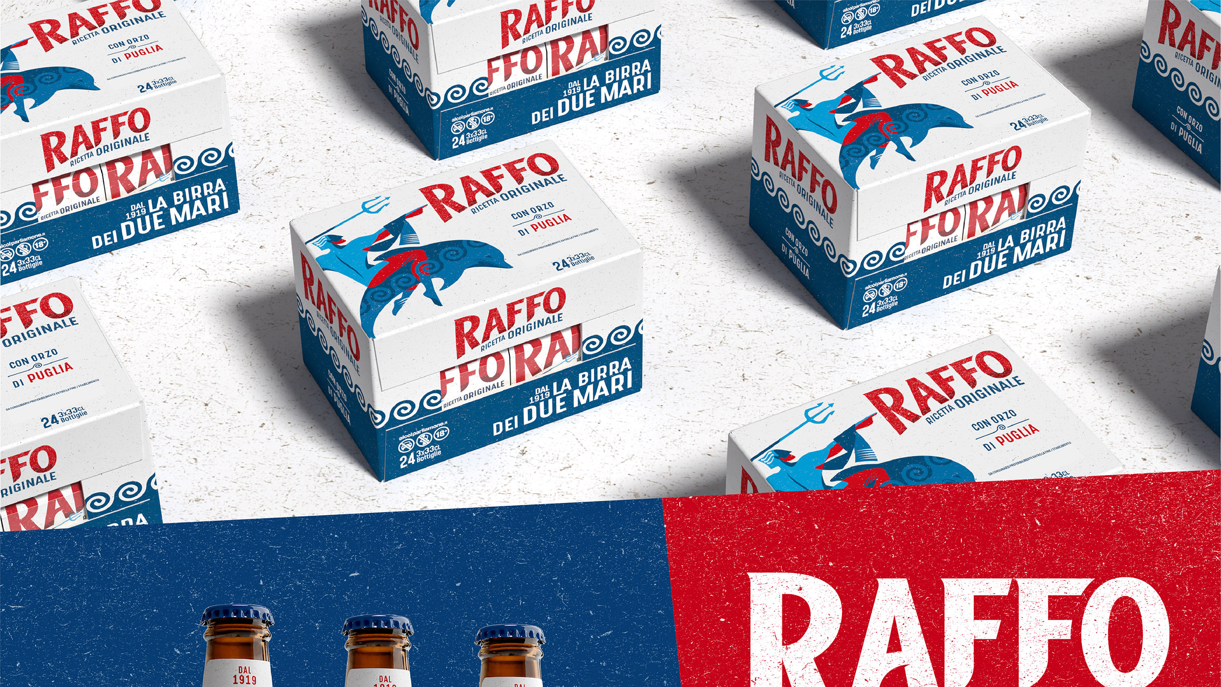
Birra RAFFO
Dal 1919 la birra dei due mari
Myth, authenticity, and positivity are the key ingredients of Birra Raffo’s relaunch. Raffo is a Love Brand for the people of Taranto. Its personality is so distinctive that it has been decided to share its determined Apulian spirit with the rest of Italy.
Working on an iconic brand is always a delicate operation. We managed to transform the brand while maintaining its authenticity, blending quality and localism in a contemporary fashion.
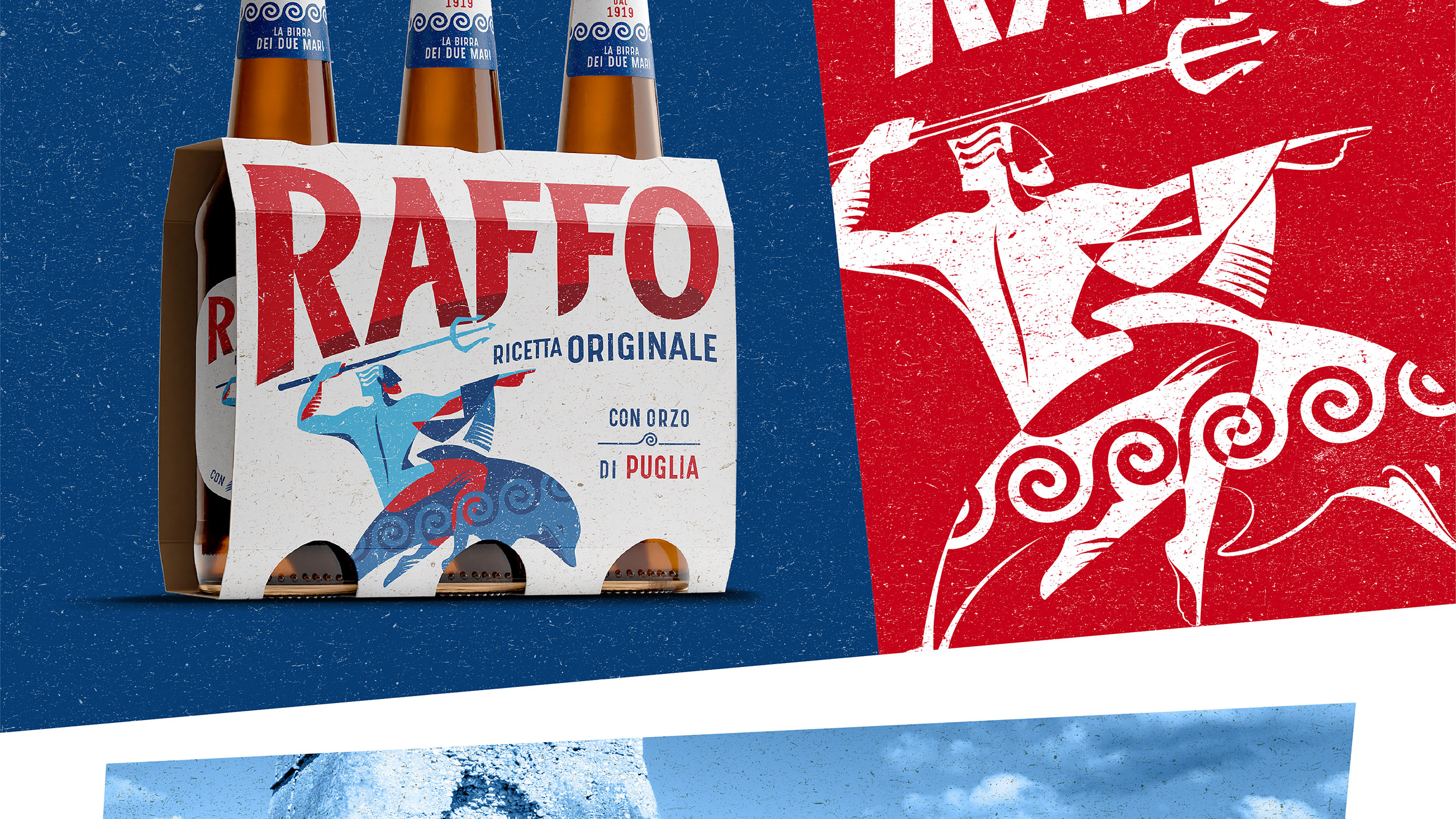
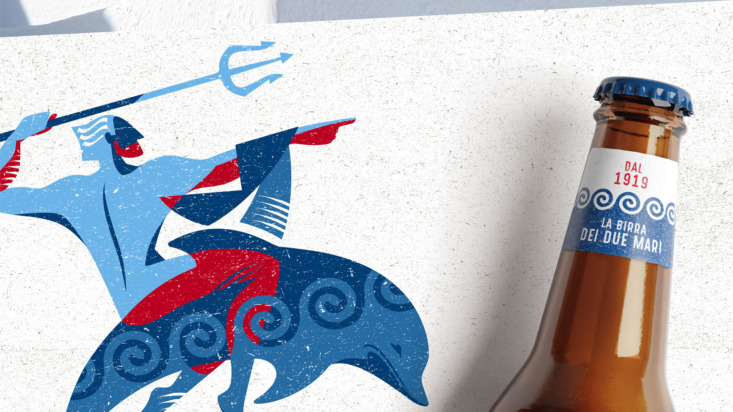
We began by evolving the brand assets. The logotype communicates authenticity and is inclined to match the posture of Taras: the mythical symbol of Taranto and Raffo’s brand icon. Taras has been completely redesigned and looks proudly to the right, indicating a positive vision of the future, while the colour treatment reinforces the multi-faceted and energetic Apulian character. The wave motif is a new asset but is fundamental to the storytelling of the brand’s strong connection with the sea.
brand identity, packaging system, brand repositioning
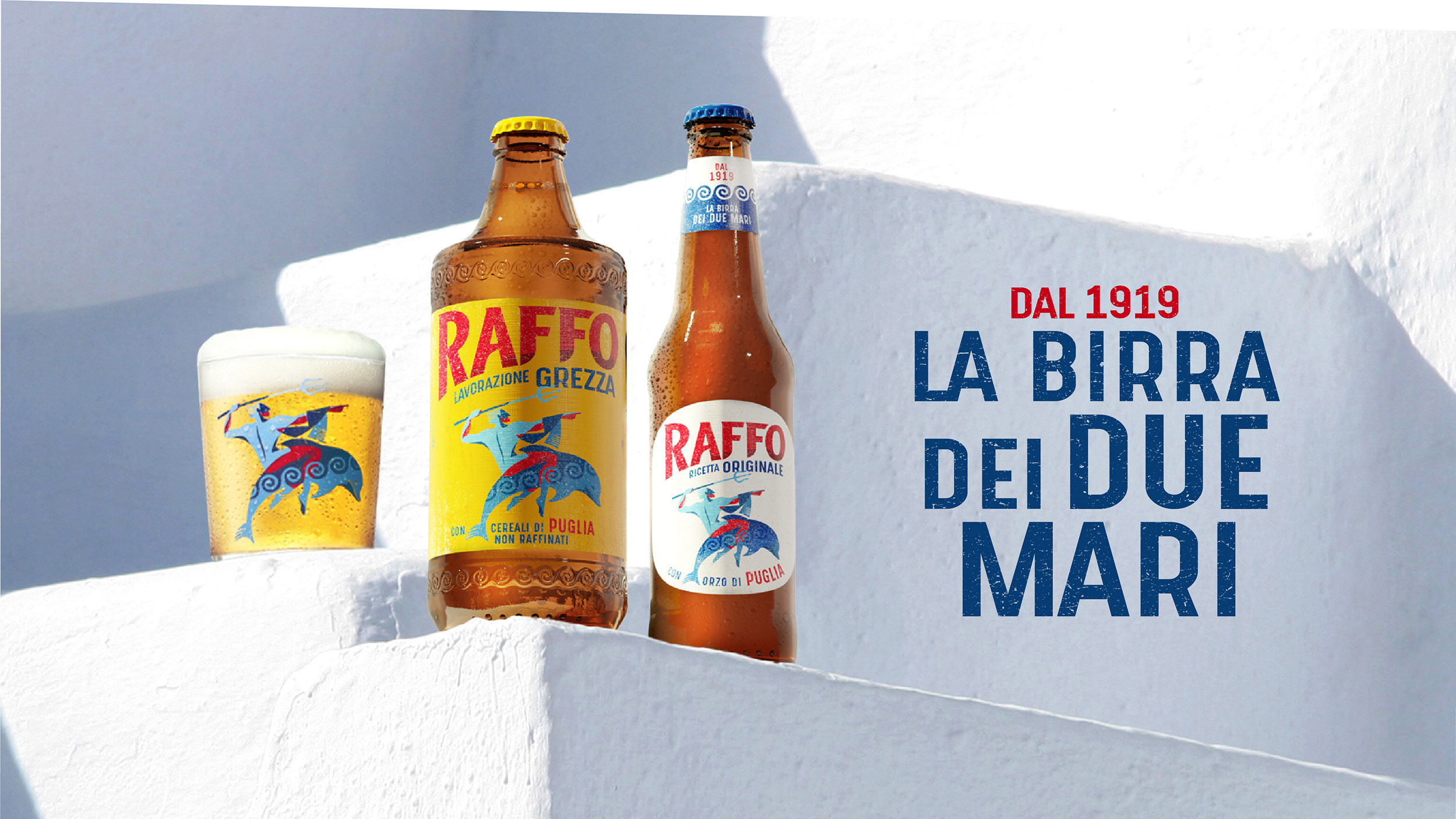
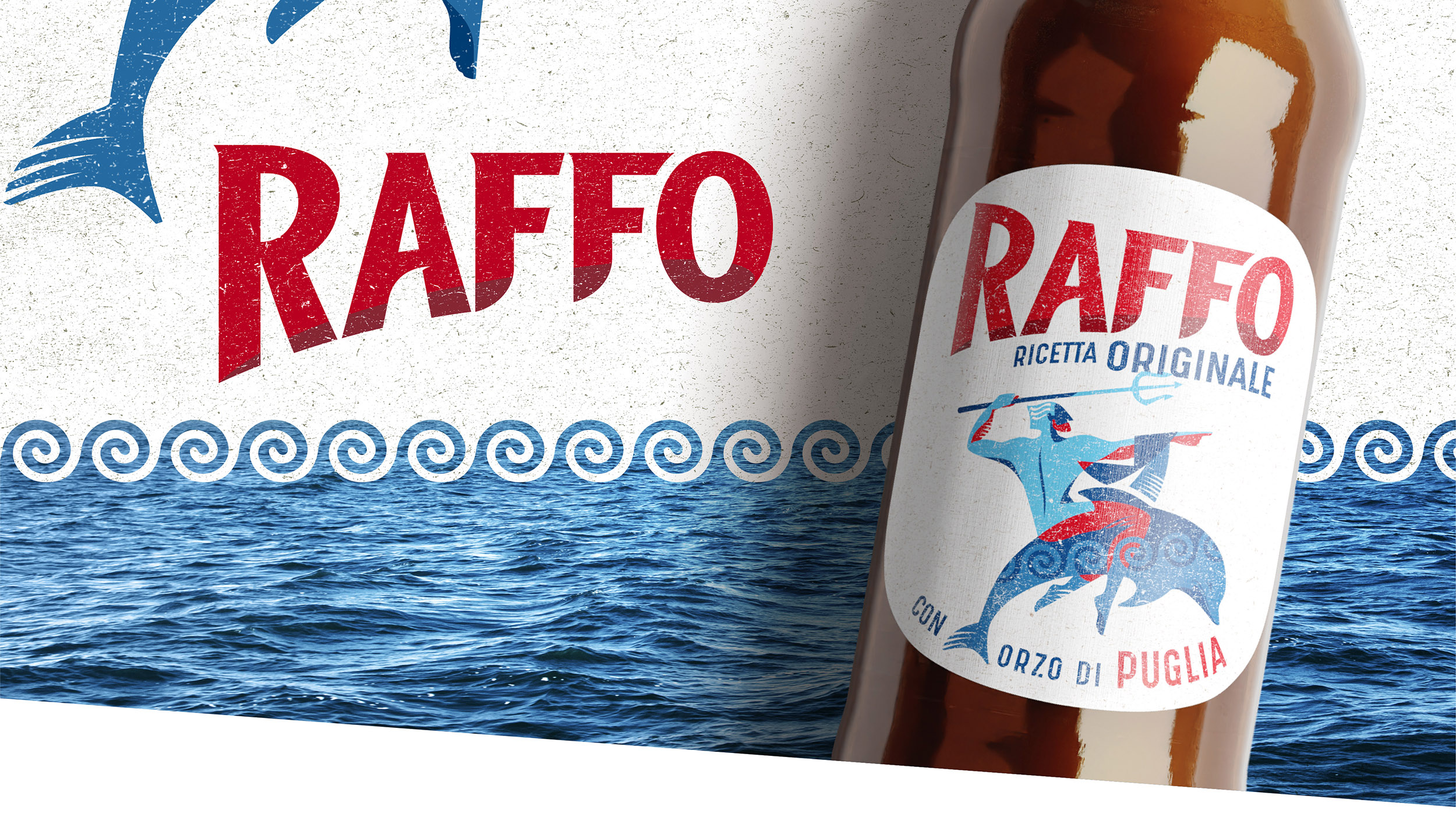
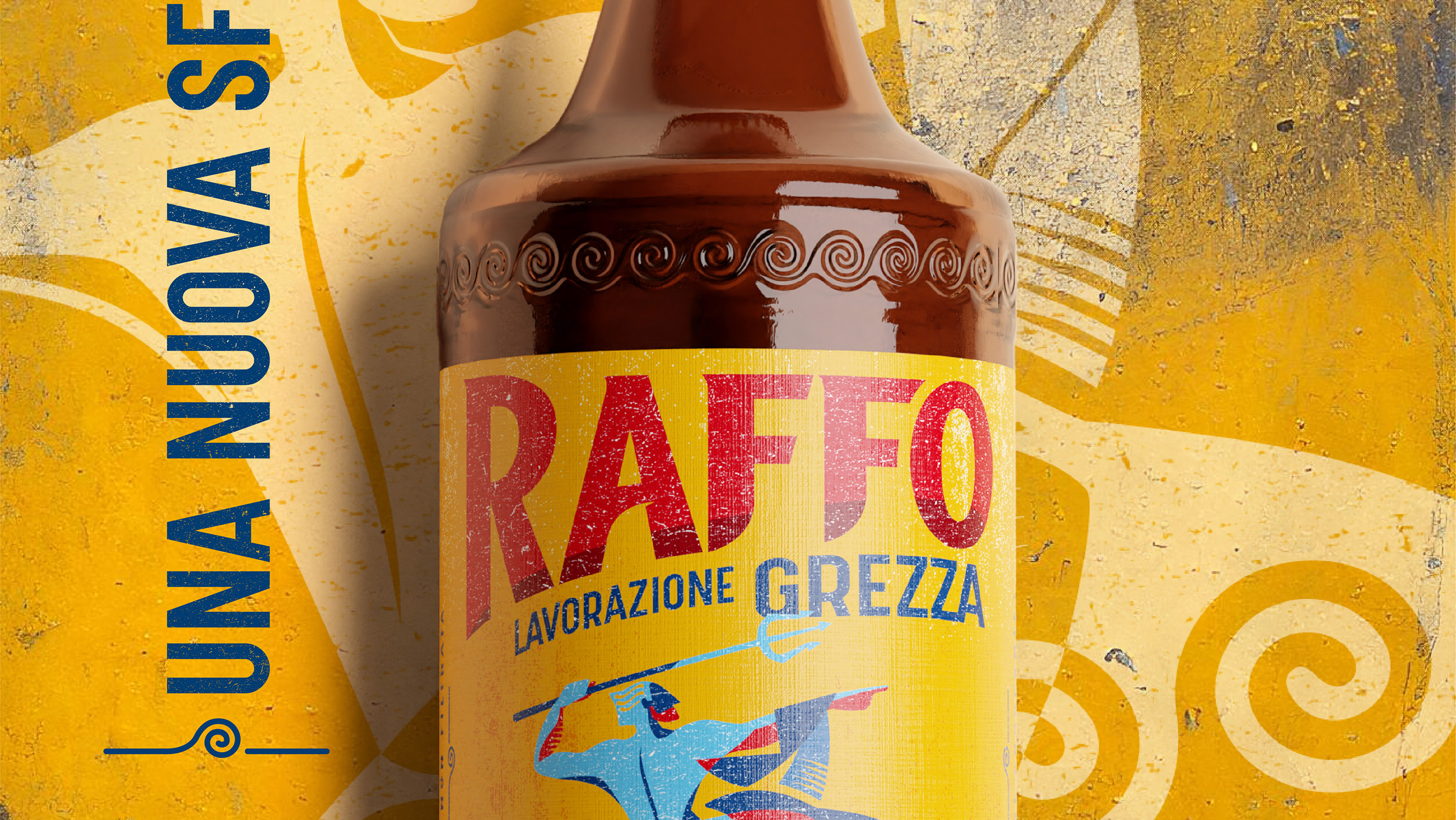
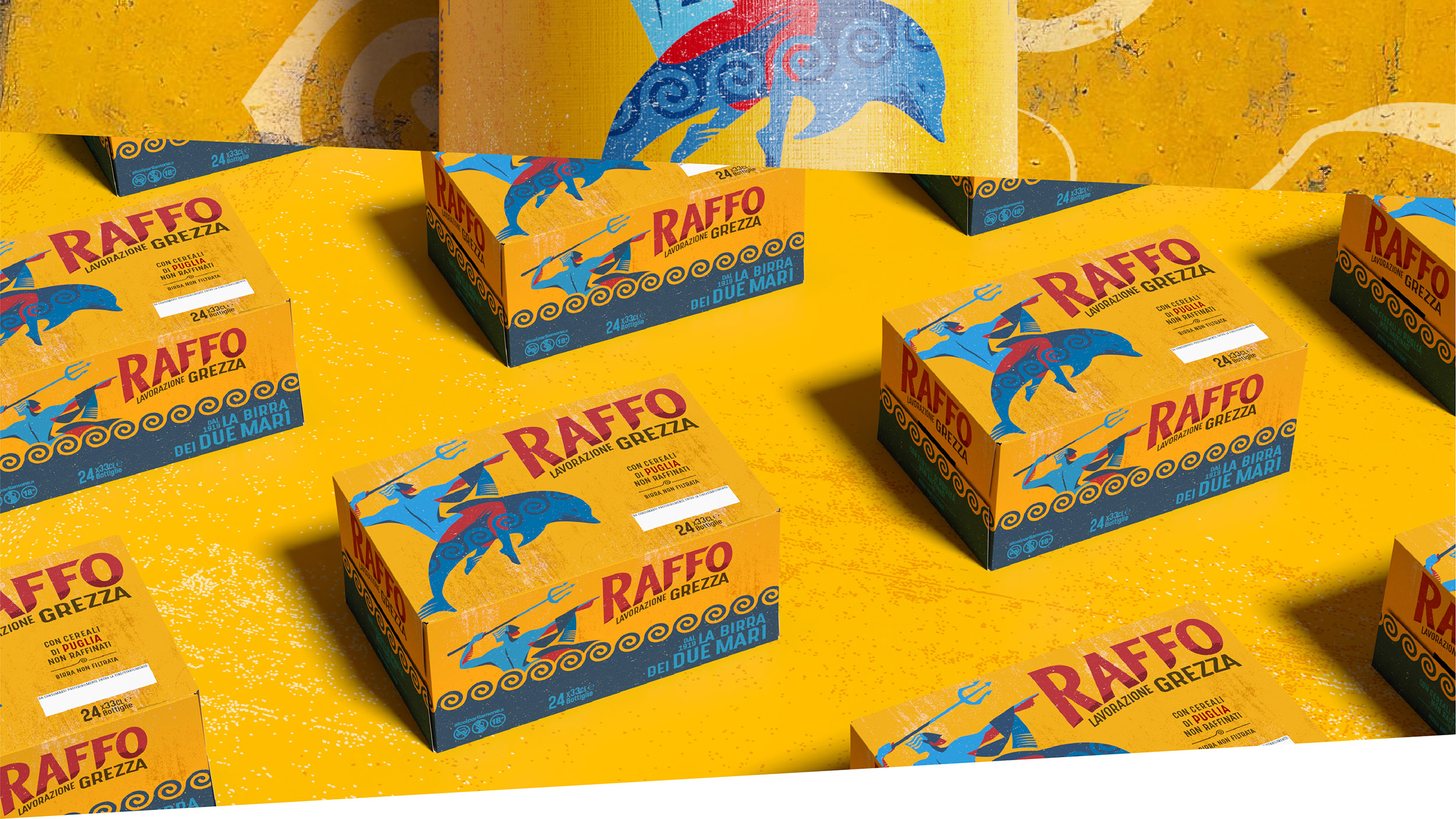
Raffo’s identity is deeply rooted in its Apulian origins, which is reflected in the use of local ingredients. This focus on the territory led to the launch of a new product, Lavorazione Grezza, made entirely from unrefined Apulian cereals which imbue the beer with a distinct and authentic flavour.
The packaging should support this sense of place so we designed a proprietary bottle which is inspired by the towers of Taranto’s Aragonese castle and embellished with a stylised wave emboss. The design is consistent with the core reference but has an intense golden colour inspired by the Apulian sun and a textured effect that reflects the unrefined nature of the beer.
Raffo’s Puglia is not just a region, it’s a state of mind. Its visual identity now conveys this message to all of Italy.