ceres loves cans
A visual revolution
When we were asked to design the packaging for Ceres’ entry into the canned beer segment the brief naturally suggested starting from the established Ceres bottle visual identity.
However, sometimes we need to take courage from our convictions and propose an alternative way of expression. We were convinced that consumers were ready for a Ceres that broke abruptly with its traditional image to be much more consistent with the disruptive brand values developed through their social media communications.
So, for the first time in a concept presentation, we proposed a design which was not in continuity with the consolidated visual identity but was consistent with the perceived brand positioning. And we were right to trust our instinct! The Ceres communications identity has now been effectively translated into a coherent product identity. The can designs are so popular that they have now influenced the more traditional bottle brand identity.
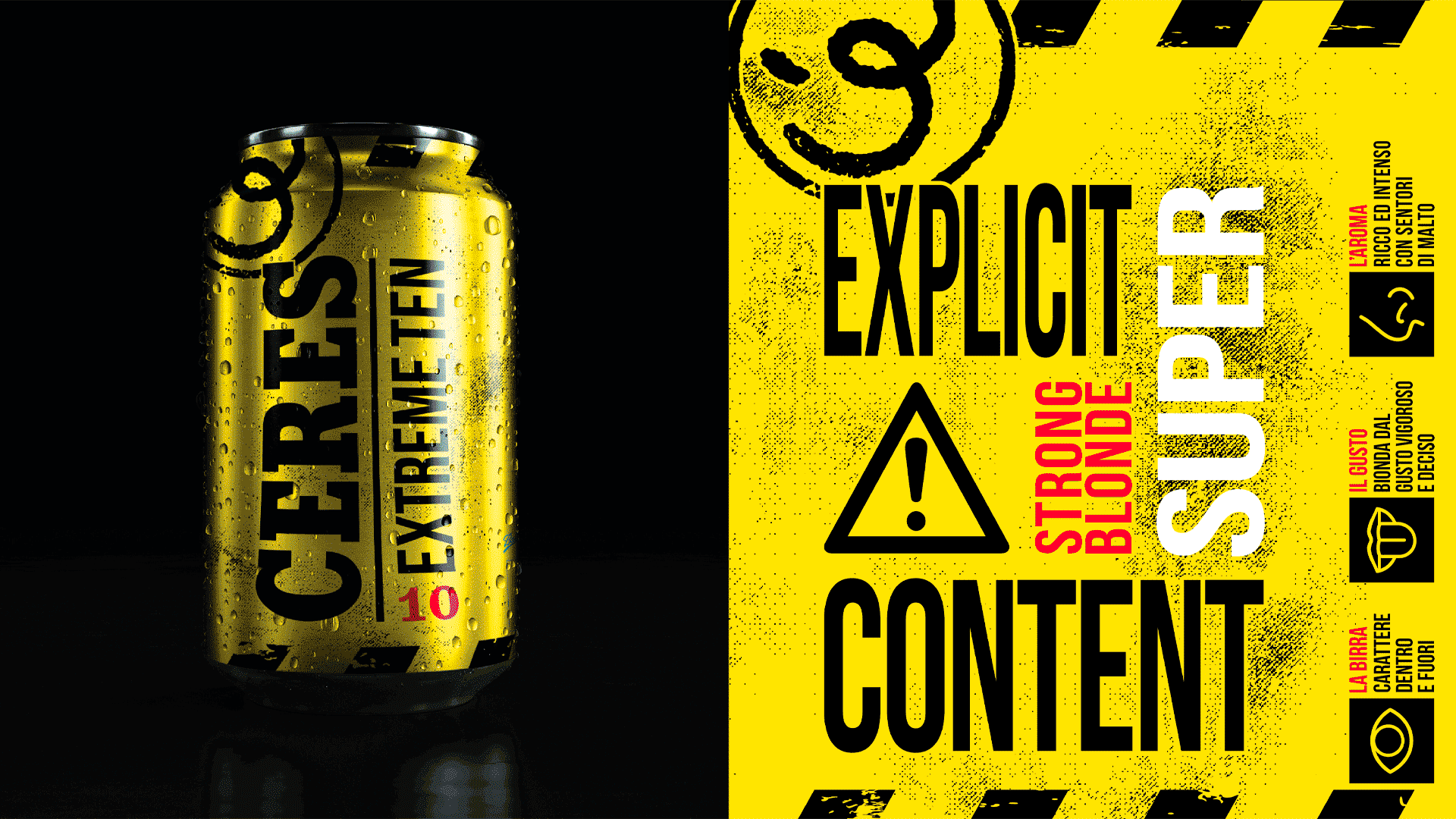
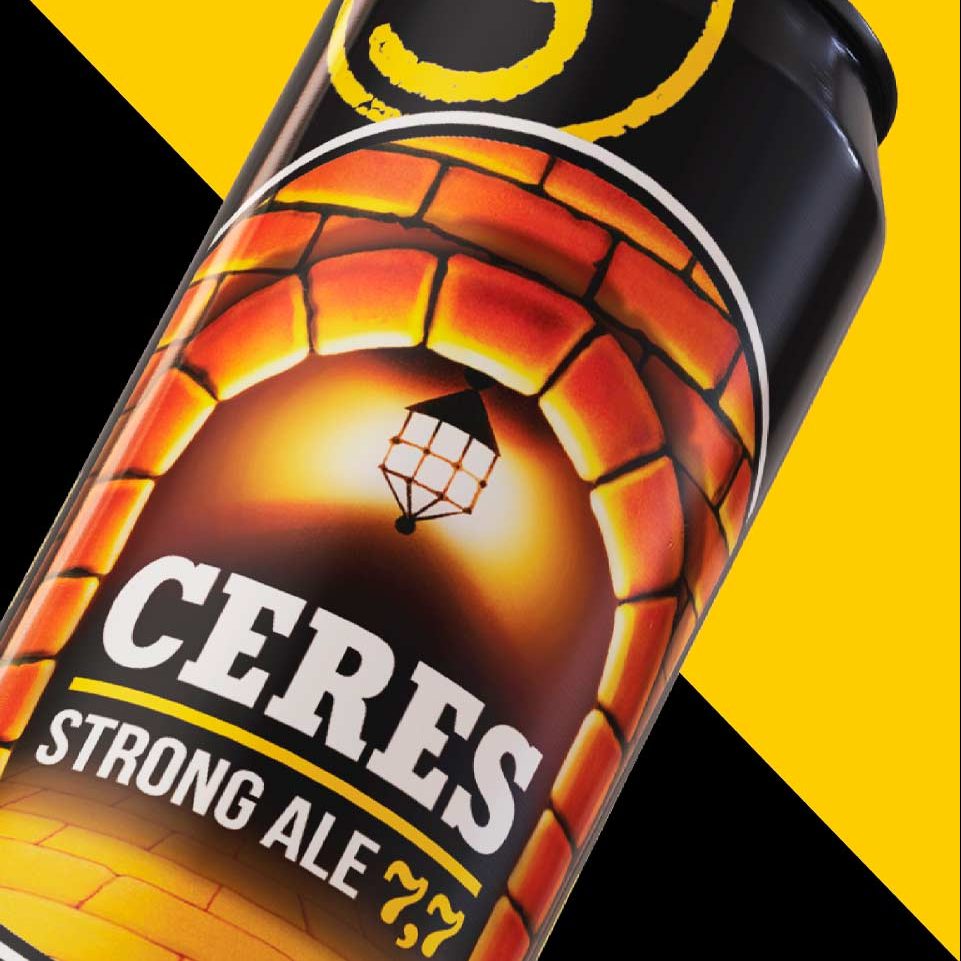
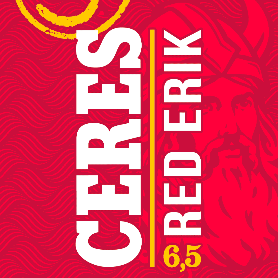
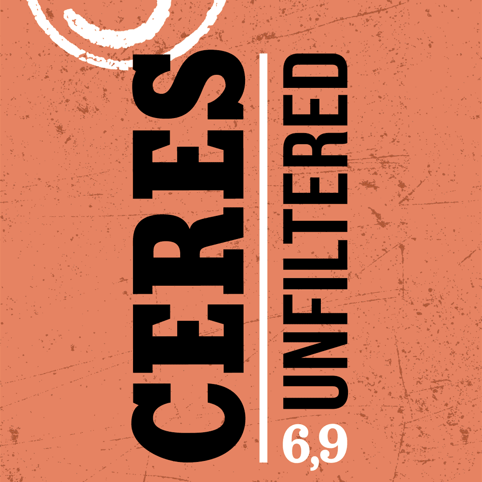
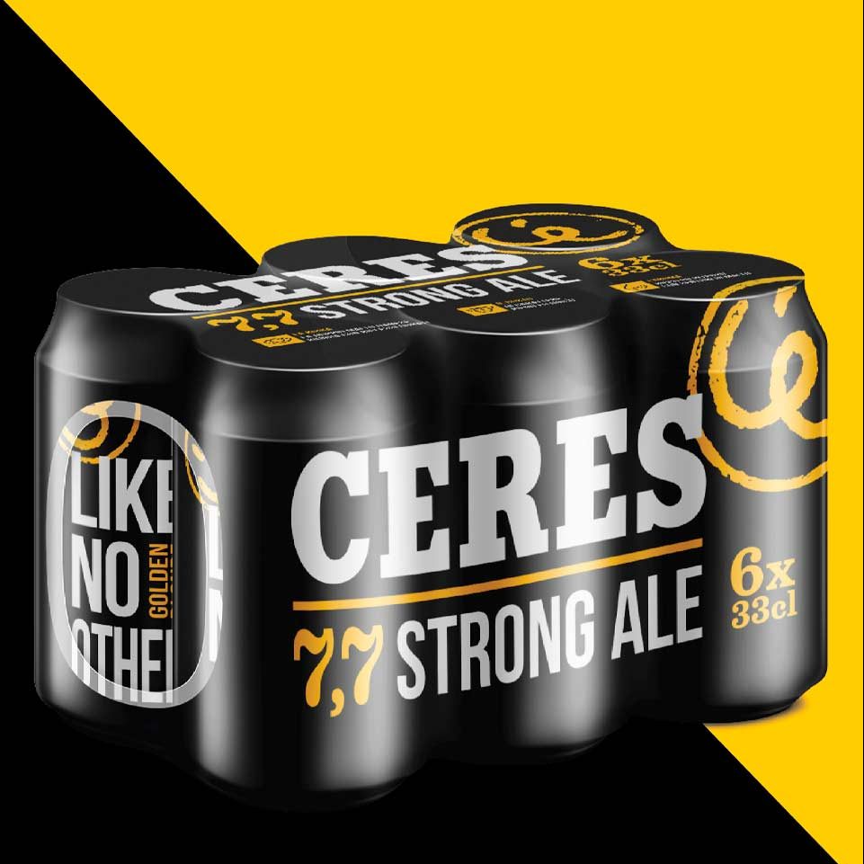
The new cans have become a cool design object thanks to their minimal, strong, street-inspired graphics, perfectly in line with the smart and provocative tone of voice of the brand.
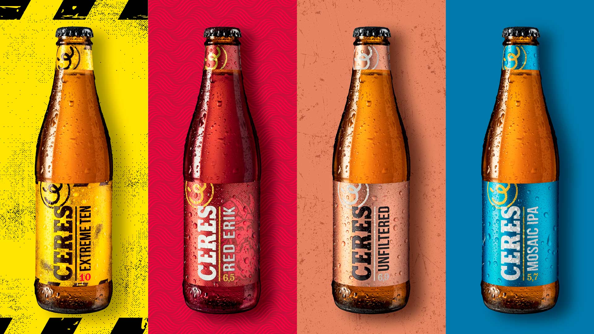
The success of this project has allowed the brand to expand its product portfolio and launch new references under the Ceres name also in bottle format.
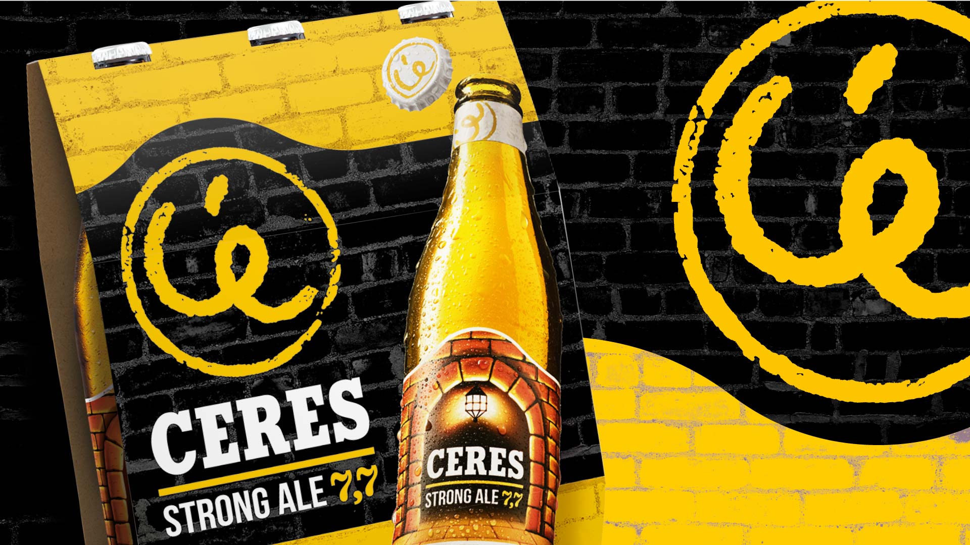
We also designed the resulting Ceres bottle range, continuing the strategic path started with Ceres cans, to give the brand a more contemporary identity in line with its personality.
The renewed visual identity has allowed the brand to support a high-impact digital campaign that has brought the brand even closer to its ideal consumer.
Smith Lumen won the TouchPoint Brand Identity Awards 2020 with this design project.