ulker dankek
Smart & sweet restyling
Ülker Dankek is the pioneer and market leader in the Turkish family cake segment, but over the years it has experienced a decline in market penetration as a result of intense competition. To contrast this decline, they decided to implement a more contemporary and younger brand repositioning and to strengthen the brand image by restyling of their logo and packaging.
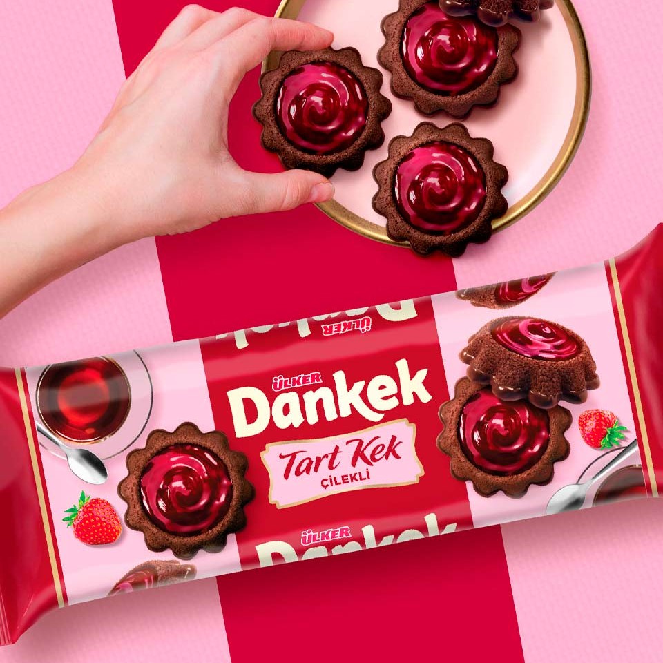
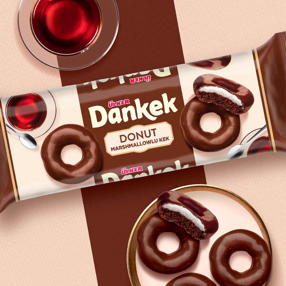
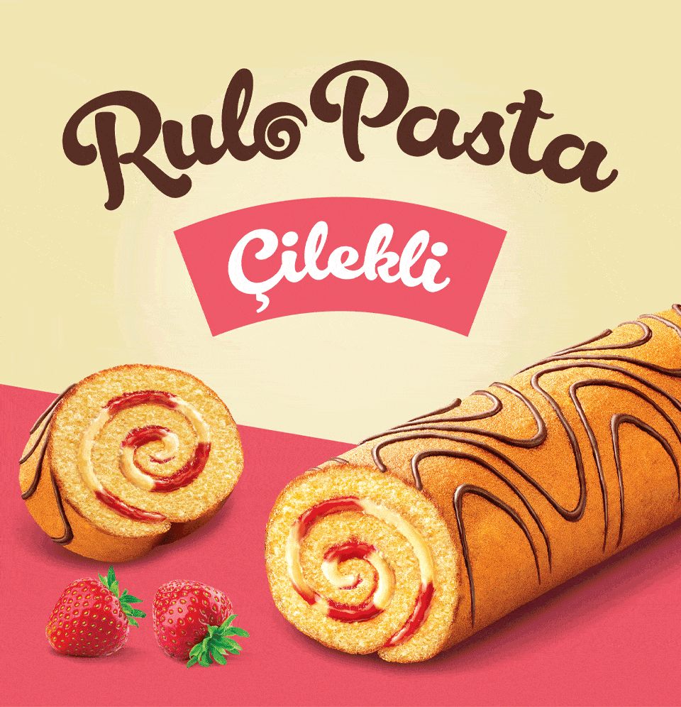
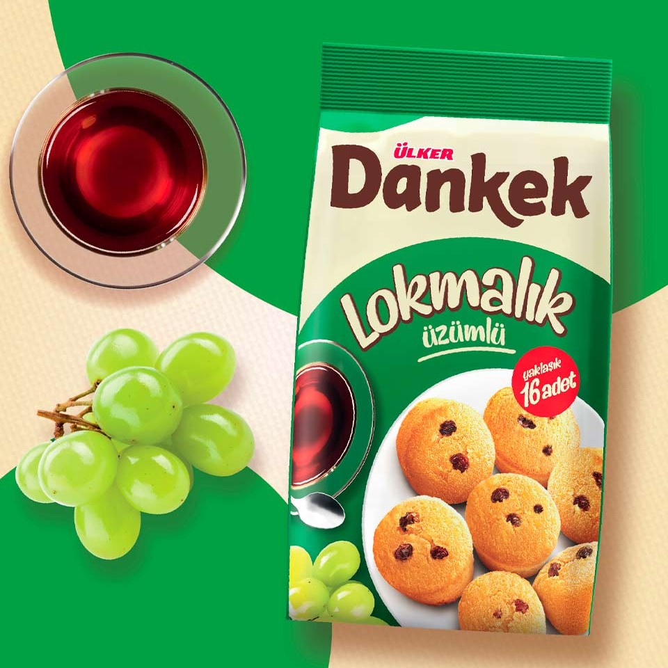
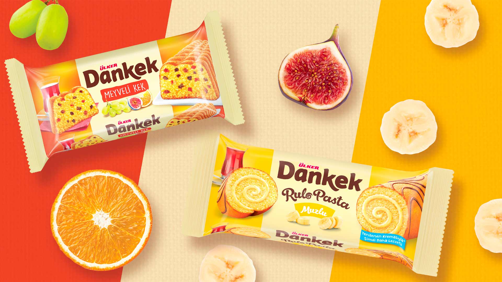
To better understand the context and appeal of the products, we immersed ourselves in the customs of the country, particularly the much-loved Turkish teatime tradition. In this moment, friends and family come together to chat and share delicious cakes. This is the main consumption occasion for Dankek products which are ideal for sharing and hosting.
We developed the “sweet conversation” creative concept which was articulated in a style designed to appeal to a younger consumer who wants to enjoy the traditional pleasure of receiving guests at home, but at the same time needs smart, quality solutions to be able to balance work and leisure time.
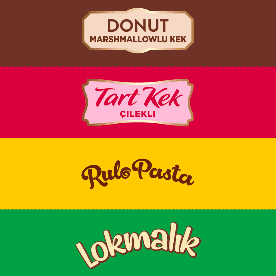
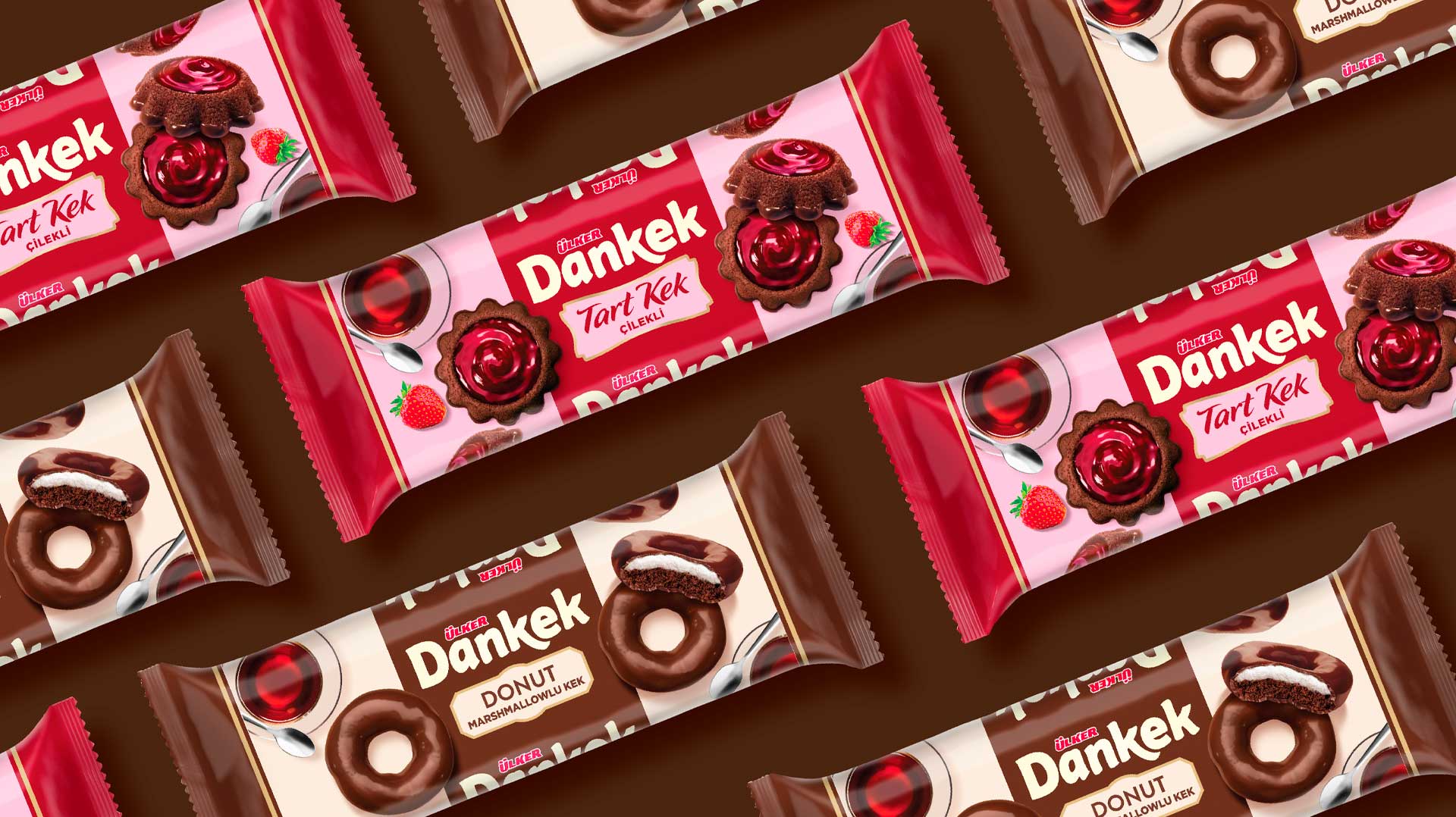
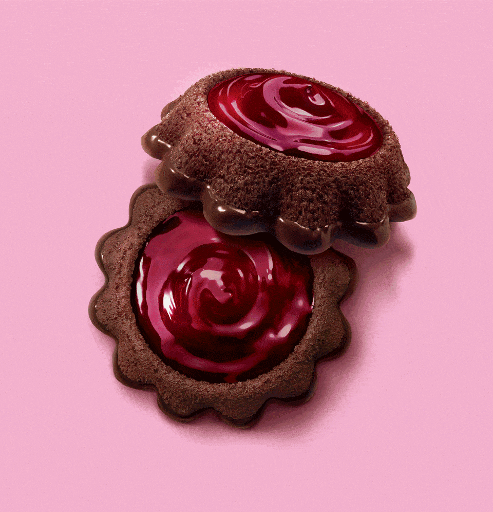
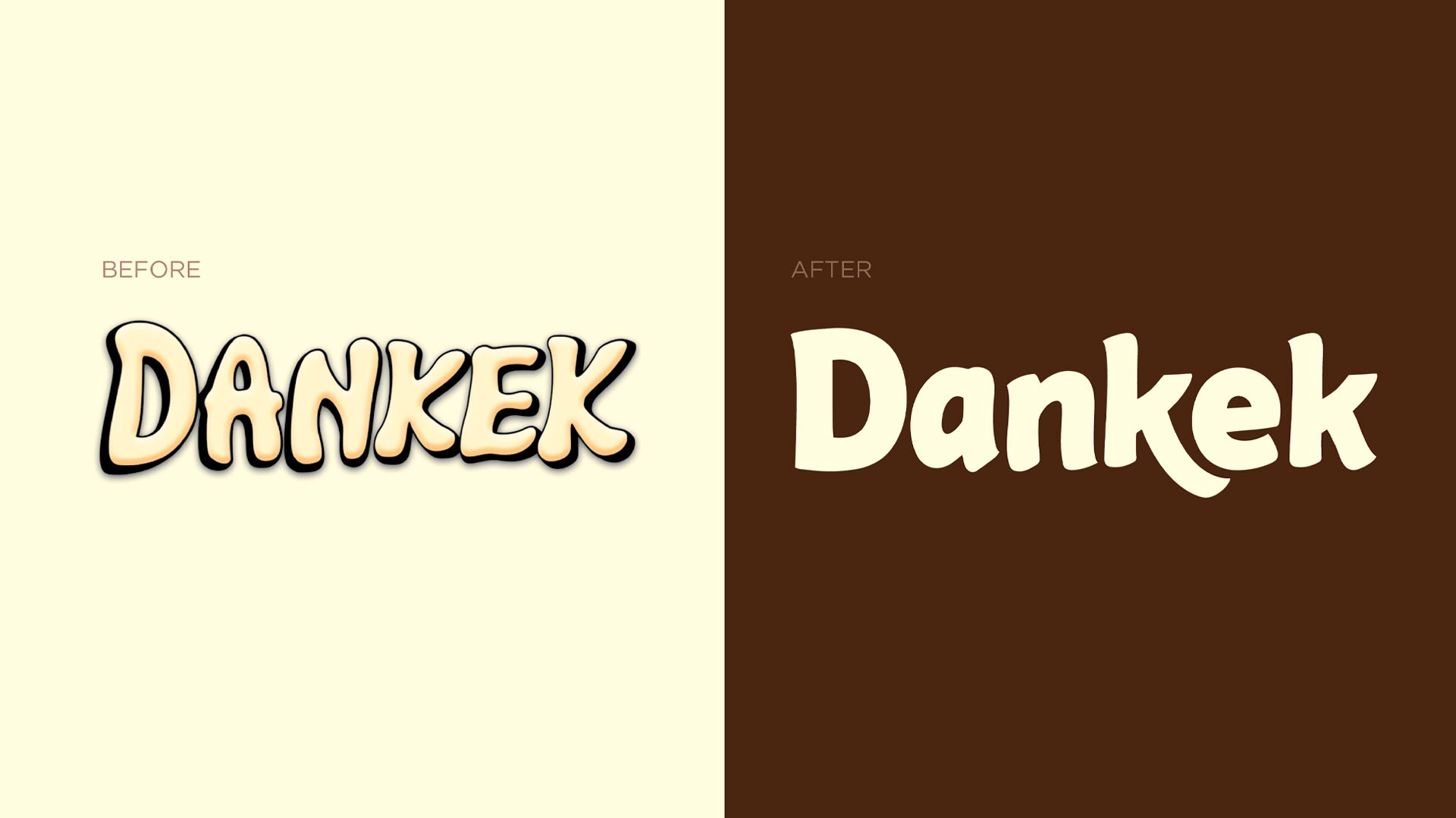
The Dankek brand mark was redesigned in a confident, modern style while each individual cake name maintained its original typographic treatment in order to avoid disorienting existing consumers. The packaging features bright colours and a playful approach to the placement of the cakes which adds a touch of fun. The products are always contextualized in the teatime consumption occasion; a clear reminder that Dankek is the go-to brand for teatime treats.