humana weaning line restyling
The color of success
Humana’s mission is to provide high quality nutritional products which allow babies and young children to grow and reach their natural potential.
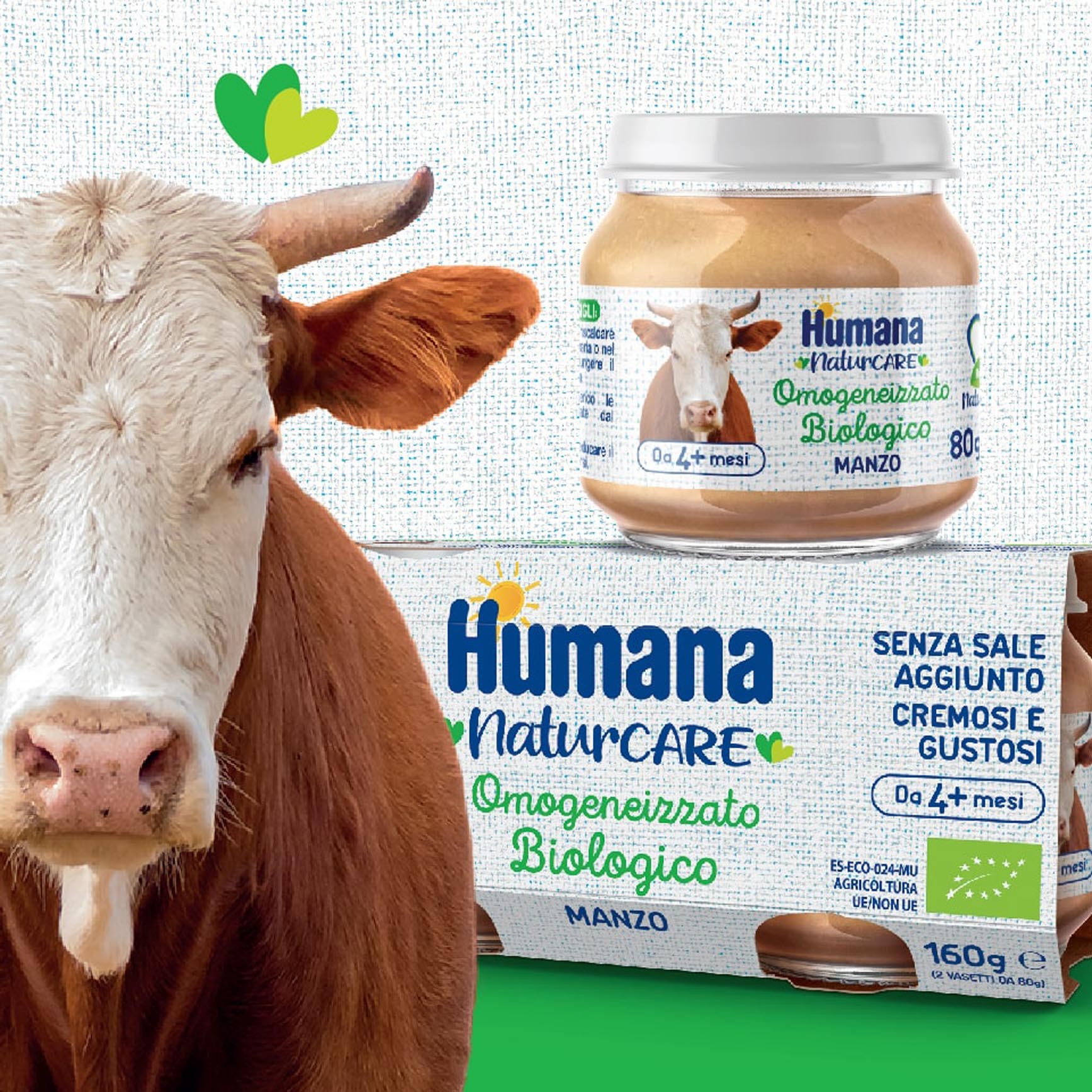
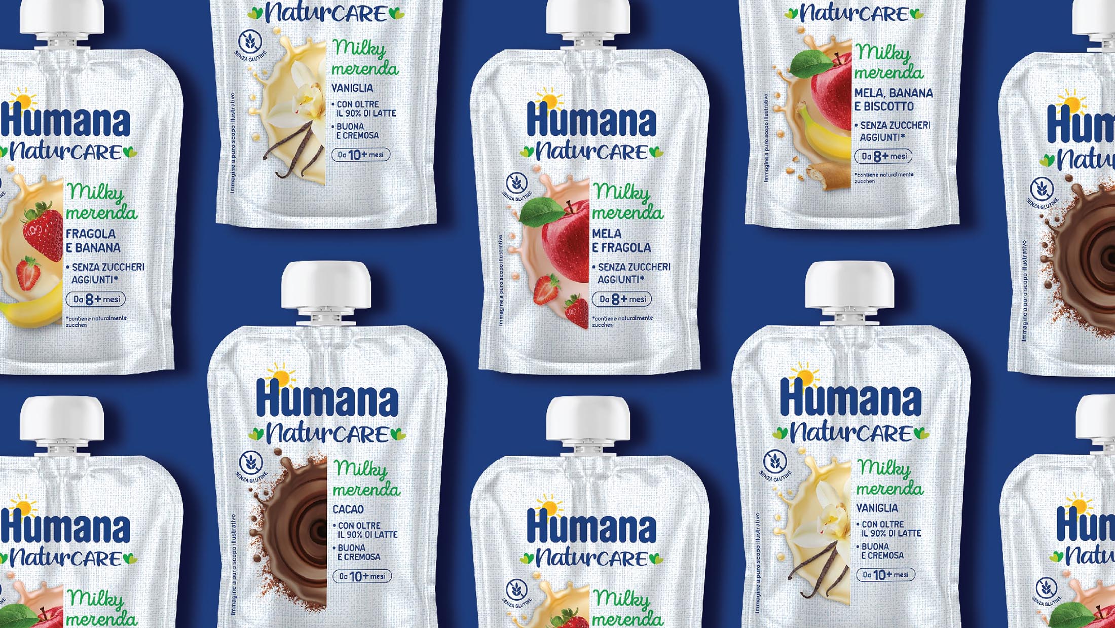
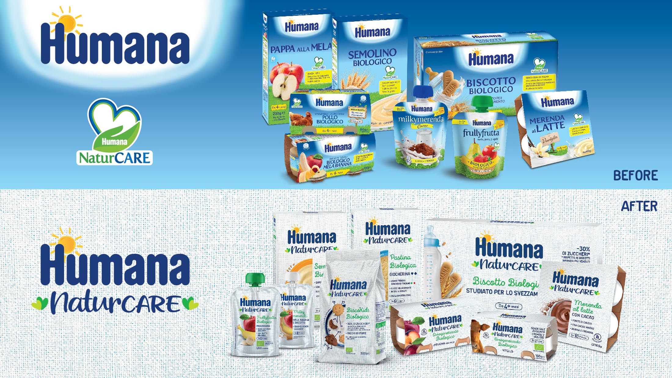
At the cutting edge of the Baby Business Unit of the DMK group, Humana asked us to strengthen its positioning in the weaning segment by creating a distinctive and differentiating visual expression for the brand.
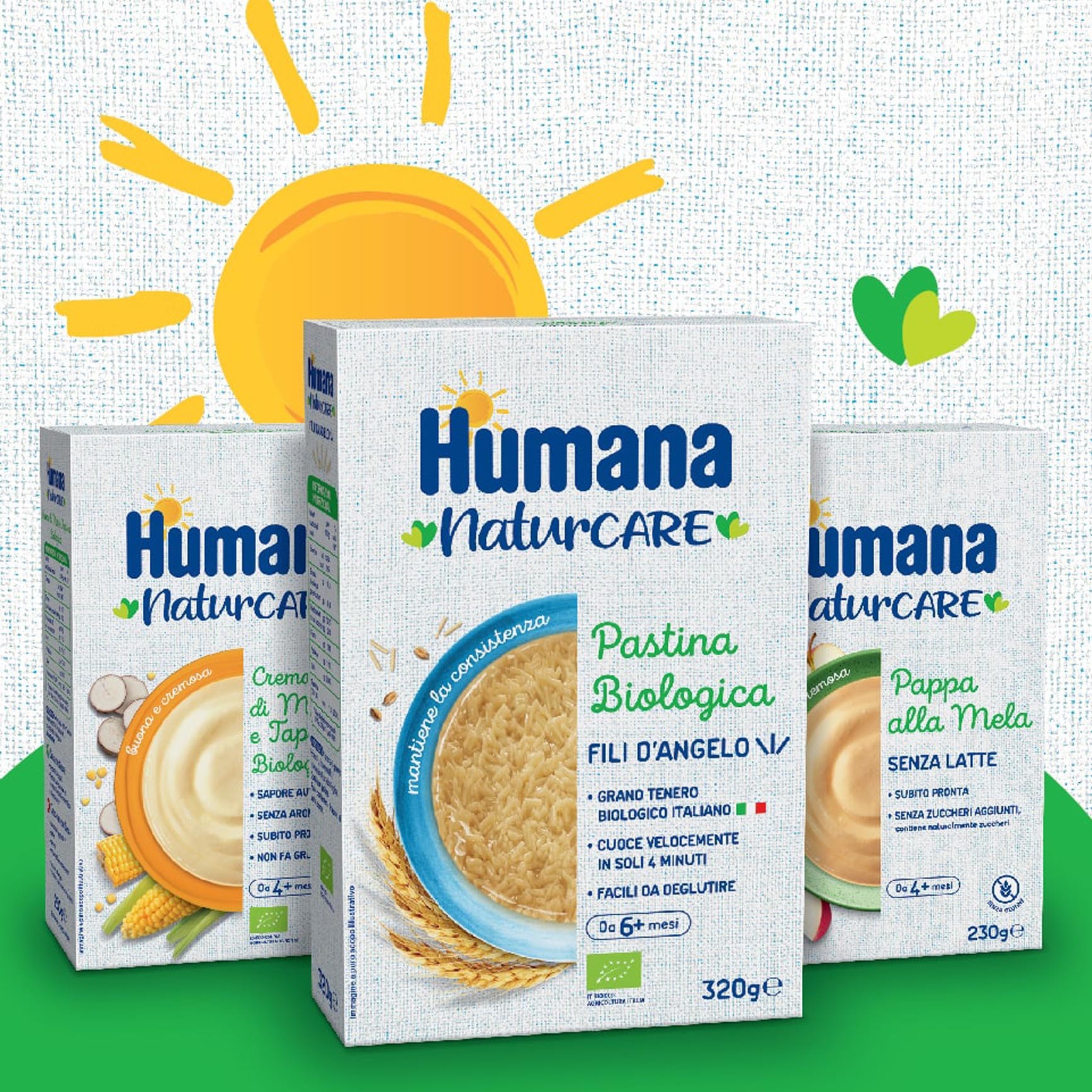
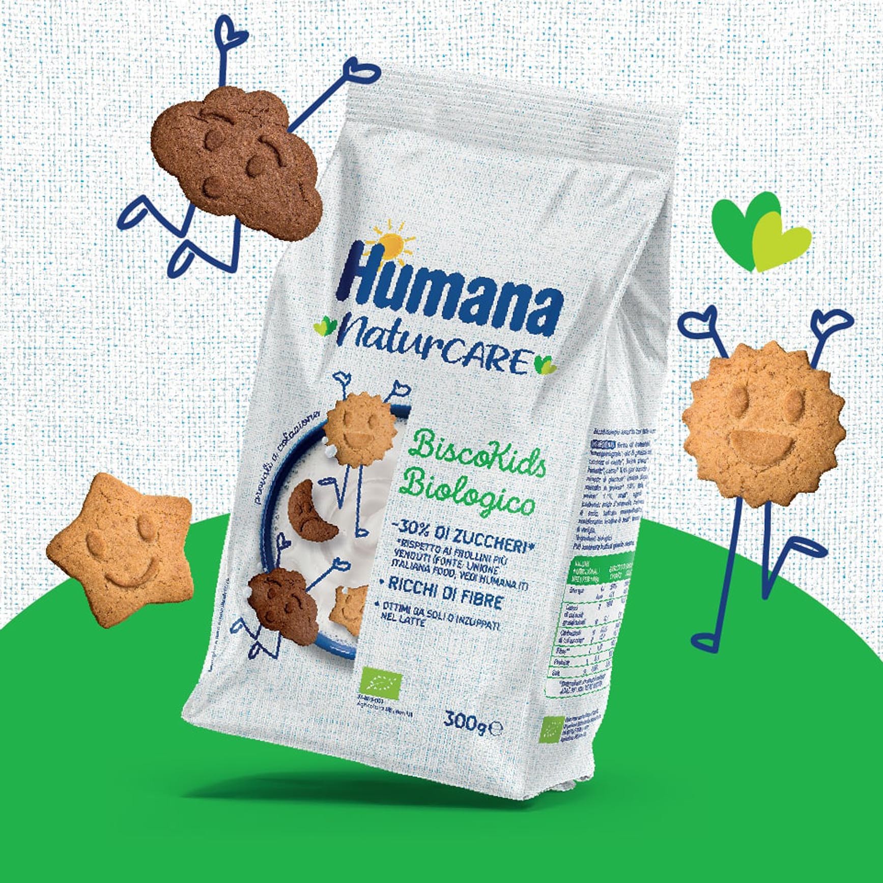
Having identified white as a unique and ownable colour code, we studied an innovative new design system for the range which offers increased shelf impact as compared with competitors.
This simple, clean colour, which has clear associations with the world of infant care, allows Humana to create an outstanding block on-shelf which is capable of attracting and guiding consumers.