IPER Amarsi e Piacersi
A new concept of WELL-BEING
Amarsi e Piacersi is the wellness product line of IPER, which is a major brand owned by the private label giant Finiper. The range gives special emphasis to a balanced approach to nutrition, thus catering to the needs of health-conscious customers seeking healthy options.
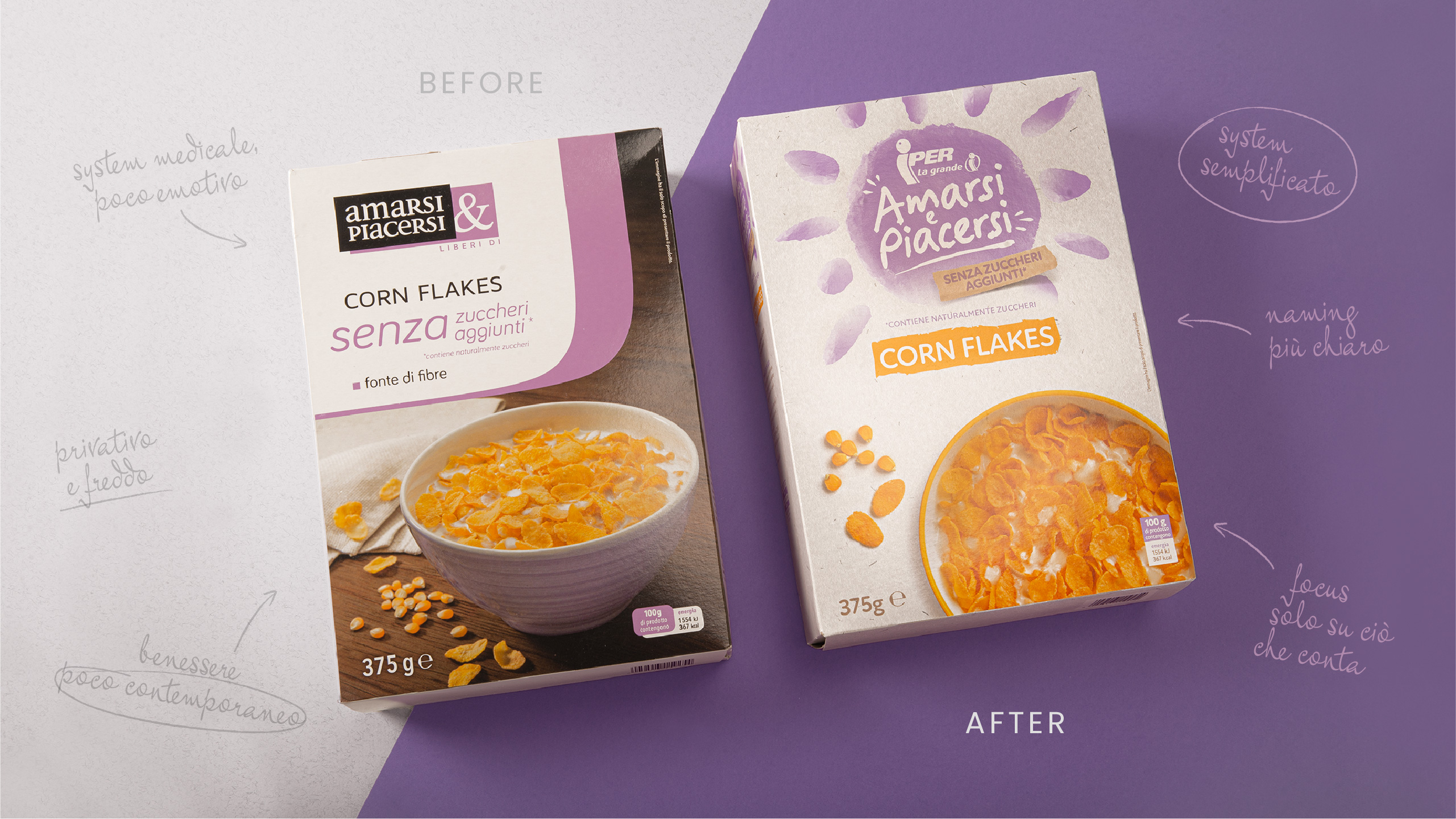
The need for a restyling emerged as the architecture of the line had become fragmented hindering the navigation on-shelf and limiting the recognisability of the sub-brand.
Additionally, the design system was outdated and intrusive, which negatively impacted the perception of the product’s value and lacked an endorsement from the parent brand, Iper.
THE SOLUTION
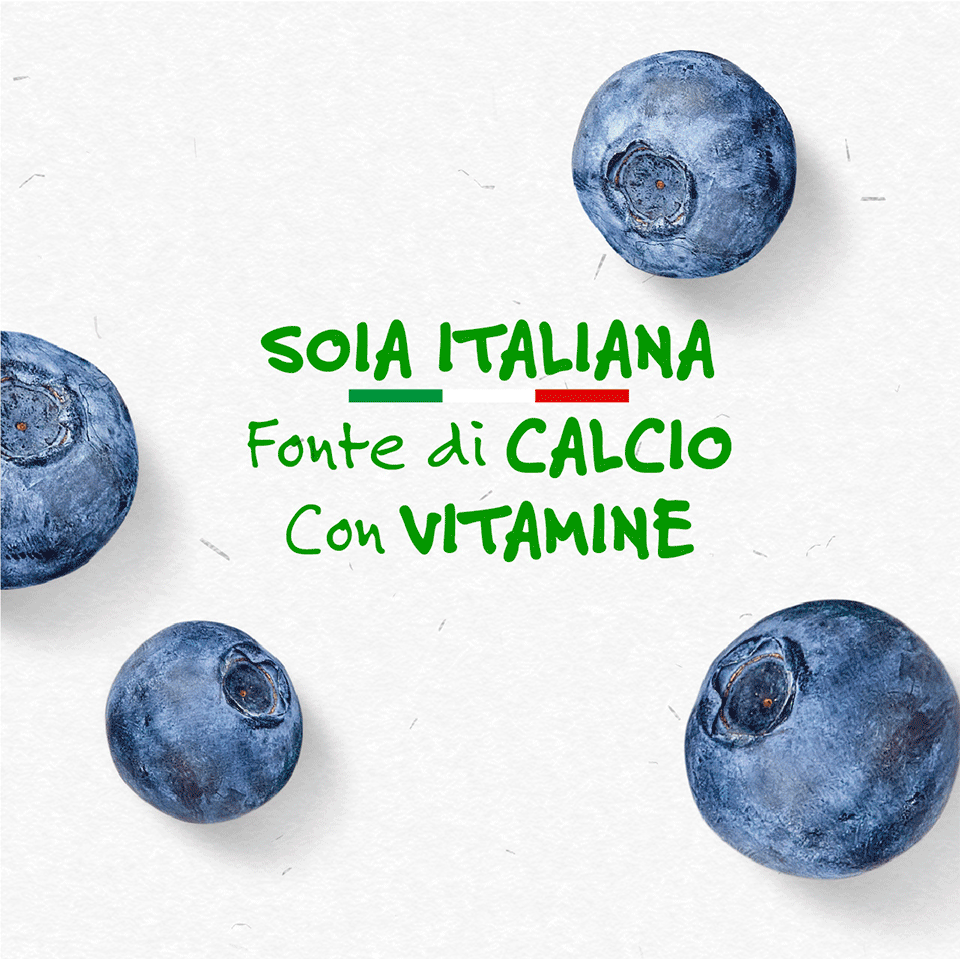
Our analysis of the brand revealed that Amarsi e Piacersi was outdated both in terms of design and its interpretation of the concept of well-being. Rather than focusing solely on physical health, modern consumers look for a more holistic approach that incorporates mental balance, serenity, and contact with nature.
Our design strategy focused on creating a visual expression for the product line that expresses an important emotional component of contemporary consumers’ concept of well-being. Research indicates that the pursuit of well-being is now viewed as a positive lifestyle choice, rather than a sacrifice.
“Free from” products should not ignore this cultural change and must express naturalness, beauty and positivity to establish a fundamental relationship with the target. As a result of the restyling, Amarsi e Piacersi takes on a more distinct personality, becoming an expression of the caregiver archetype who, in addition to promoting health and well-being, responds to needs for reassurance, empathy, and care.
This has resulted in a more inclusive brand architecture that caters not only to “free from” products but also to those dedicated to healthier, natural, and informed lifestyles. The new design system is more reassuring, welcoming, organic, and contemporary.
brand identity, product architecture, packaging system
THE RESULTS
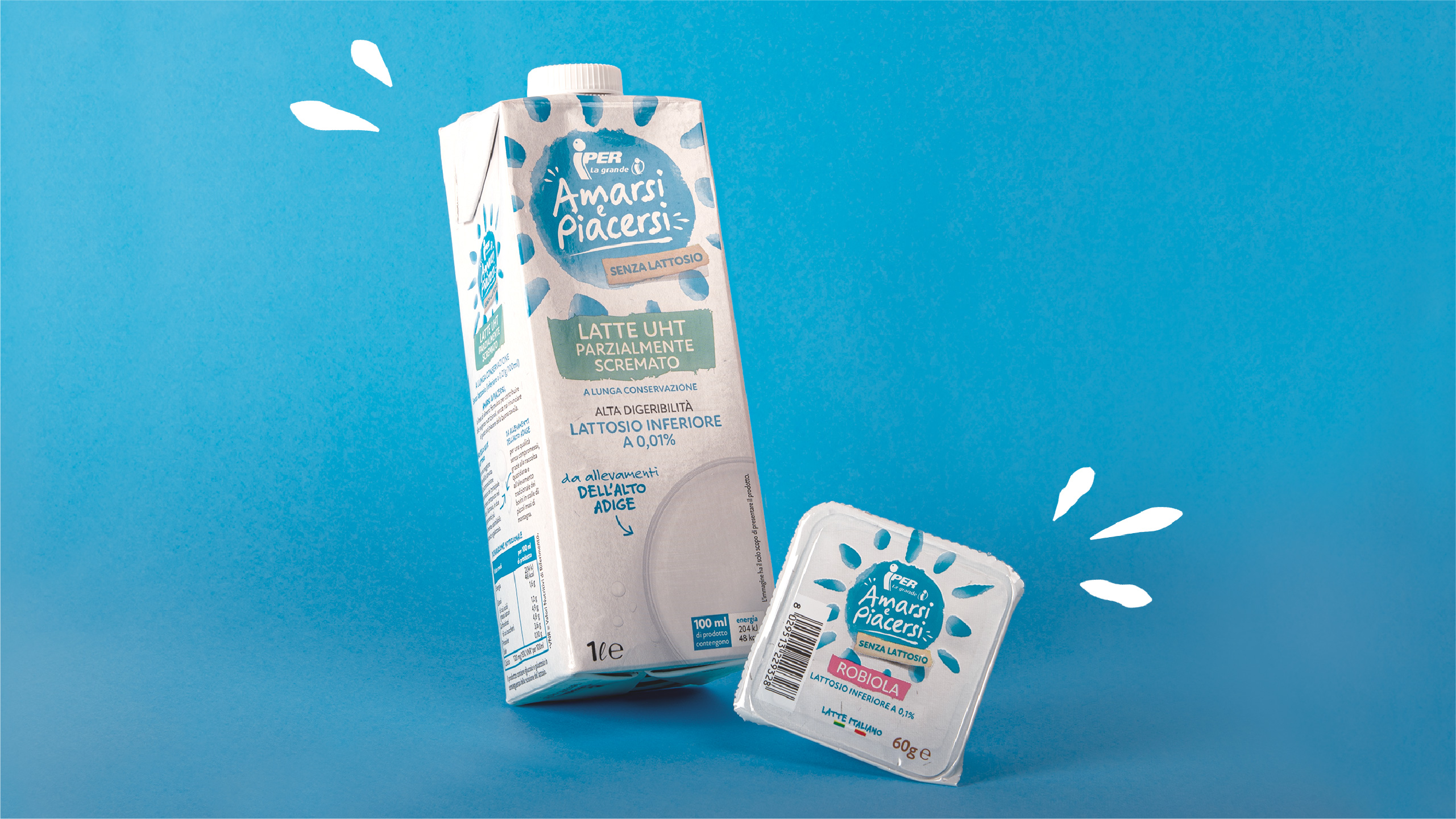
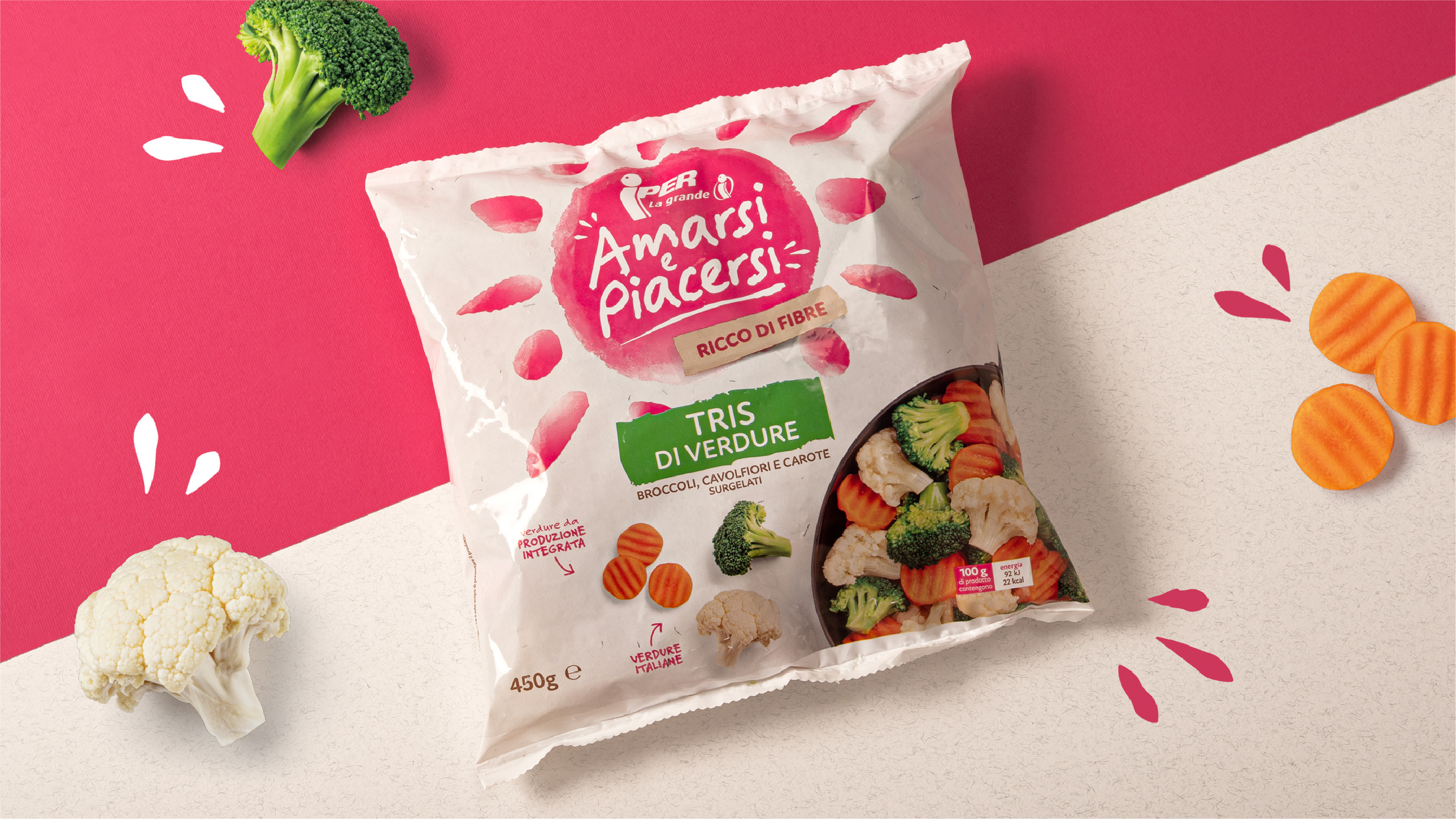
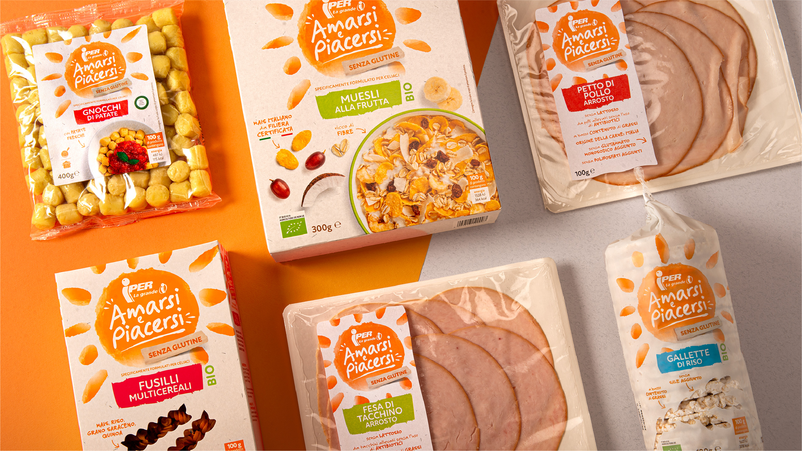
The sun is a relevant and meaningful symbol for this category and the delicate style and chromatic codes of the watercolour interpretation allow for the immediate perception of the brand positioning. The ordered declination of the design system across the range makes shelf navigation intuitive and simplified. This allows consumers to easily recognize and decode the product, along with its functional and emotional benefits.
By making a conscious choice, consumers can empathize with the brand and make it an integral part of their balanced and positive lifestyle.