star restyling
AN HISTORIC BRAND, A MODERN CHALLENGE
Star is a brand so iconic to become pop. It has been a part of Italian life for over seventy years and has always offered a way to prepare traditional Italian recipes quickly and easily.
A heritage of value and an important equity that, like other historic brands, need to evolve while embracing the new challenges presented by both the world and the market, without ever losing its authenticity.
It has thus been an honour to work on the packaging architecture restyling and on Star’s visual expression, with the objective to strengthen its brand identity and to best convey its brand values through each of its iconic products.
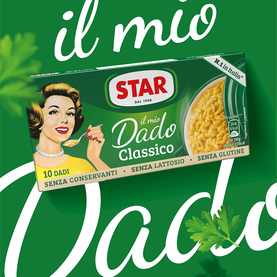
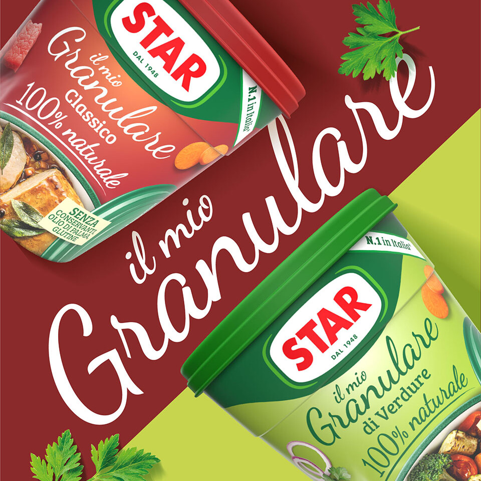
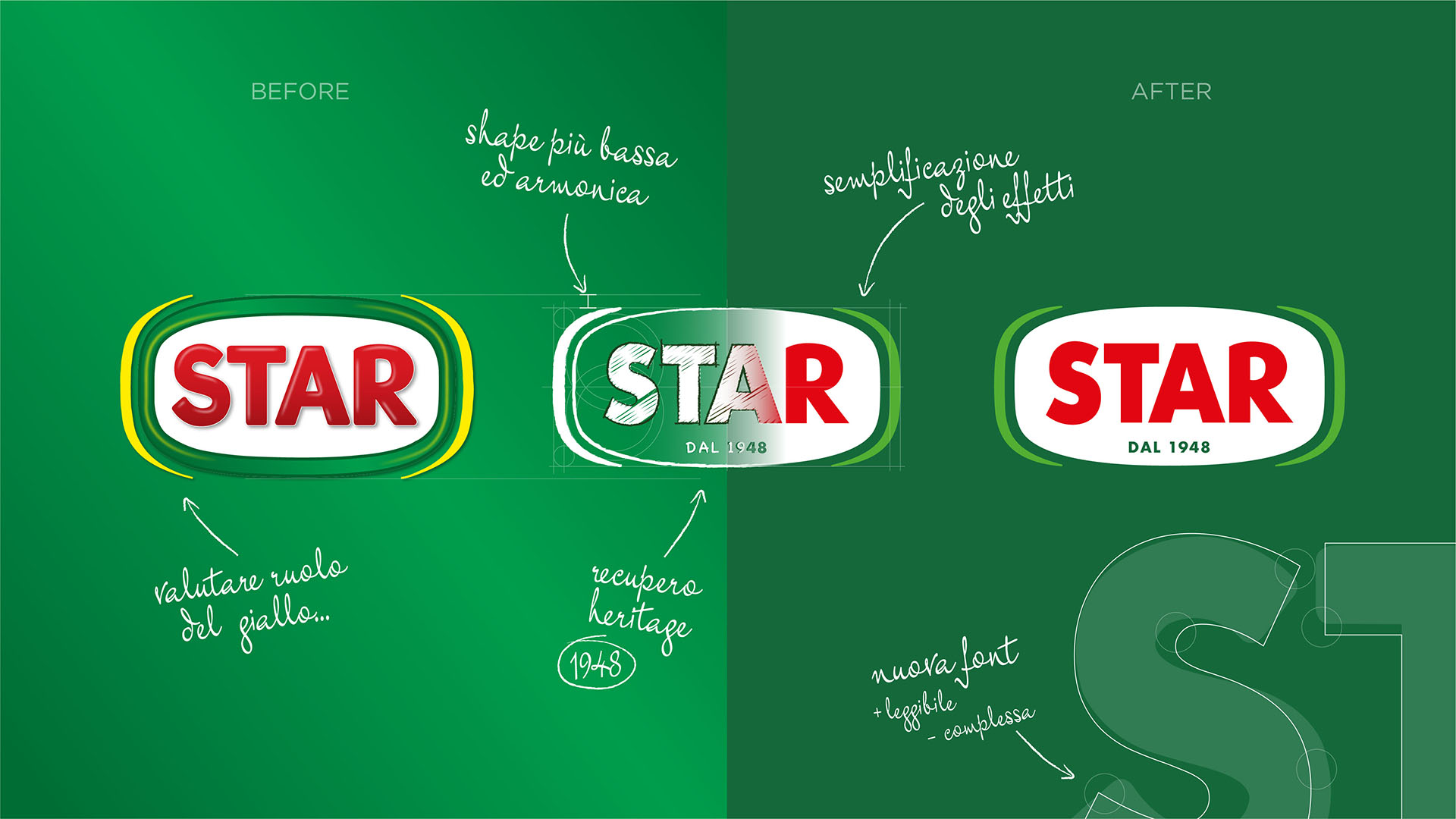
We began with the logo, the essence of its brand identity and the synthesis of our strategy for Star: we made it, on one hand, more modern by lightening it from effects and superstructures which curbed its expressive force and authenticity, but we also enhanced the expertise and the history of the brand by adding the year it was established.
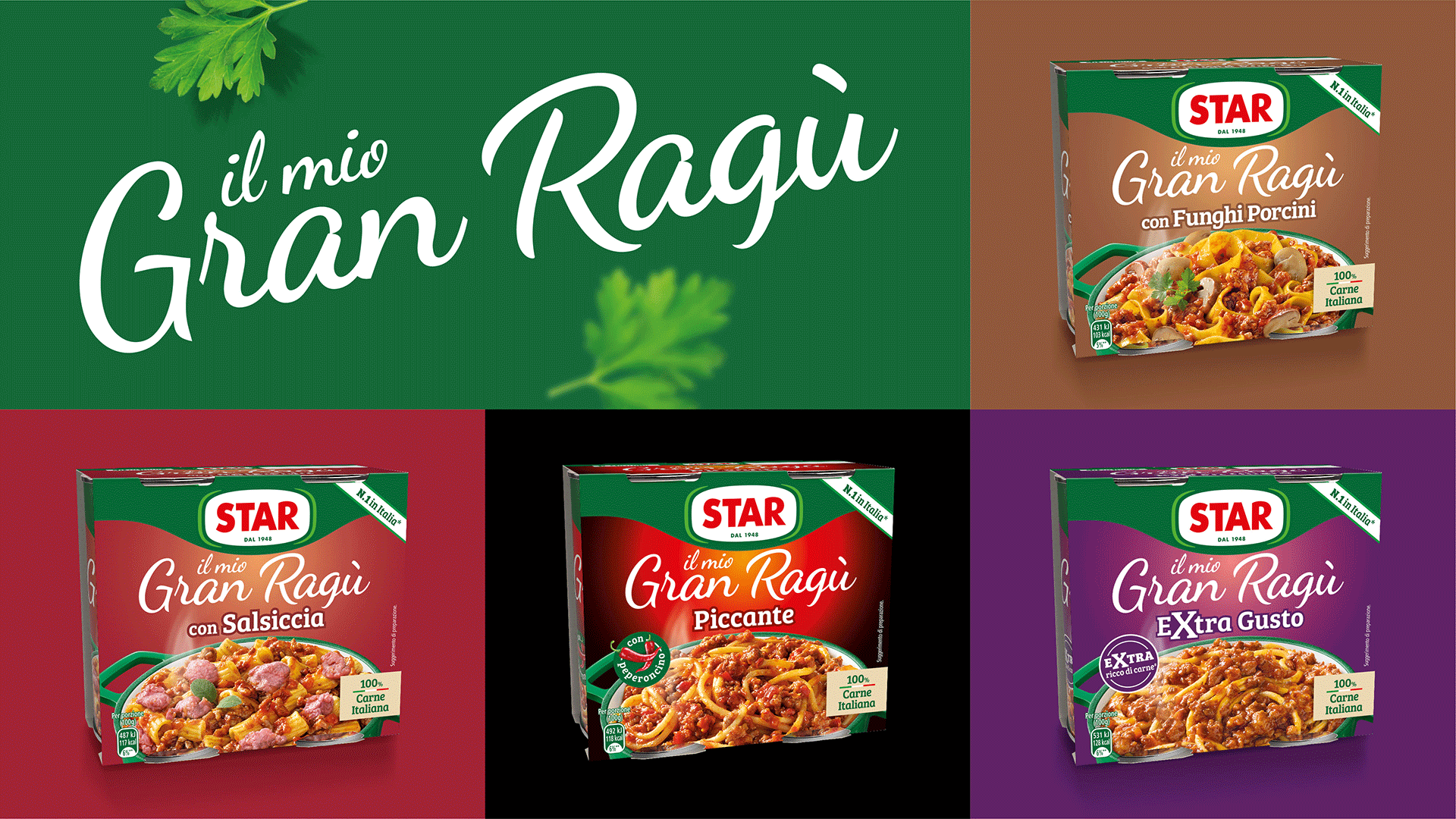
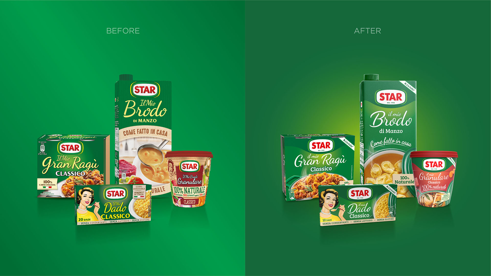
The most important challenge was that of developing a pack system with strong key assets as to efficiently express its brand identity on the shelves, but also smart enough to guarantee a smooth shelf navigation and a perfect recognisability of the different variations.
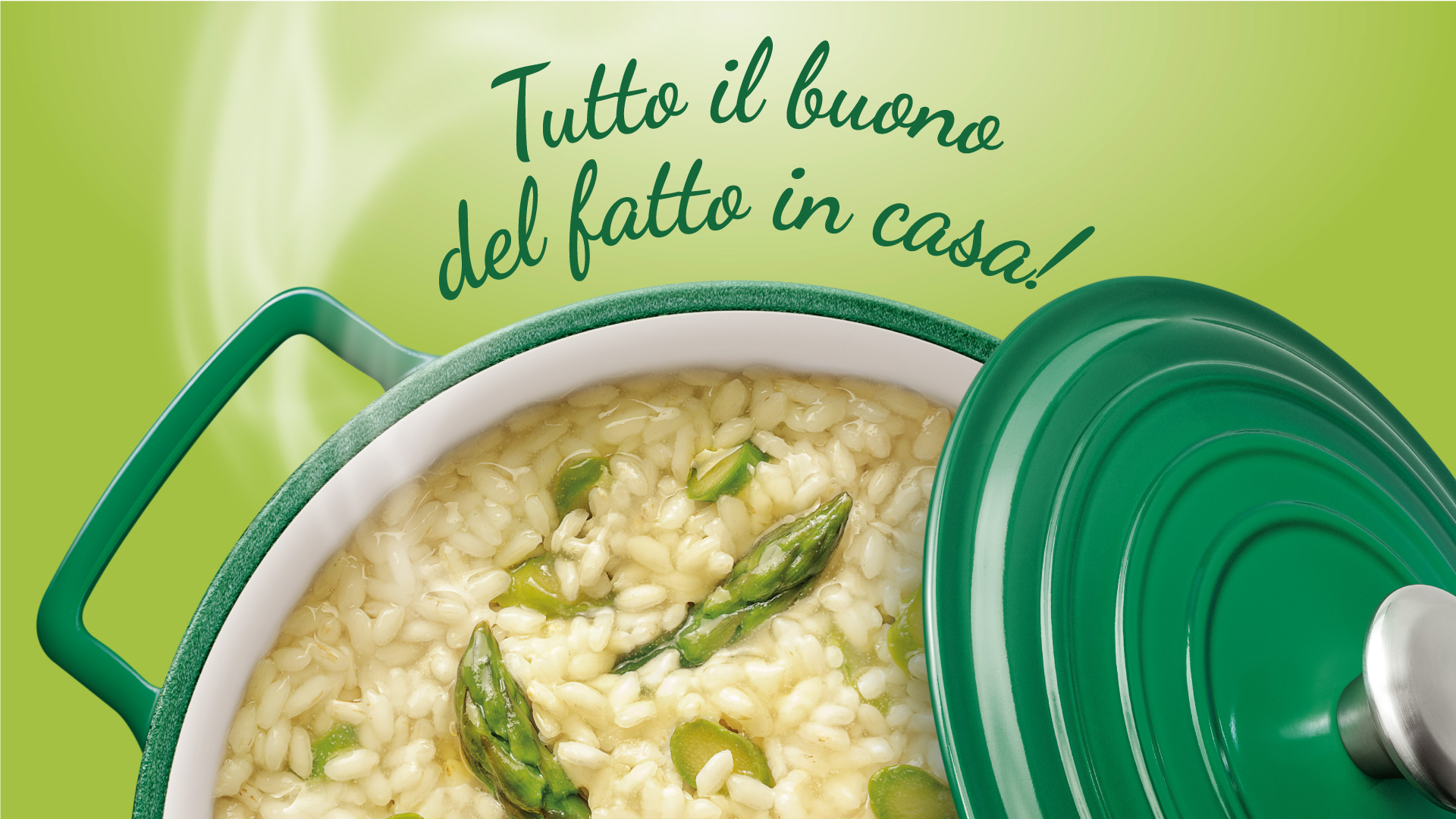
What was fundamental in consolidating the brand’s high quality and to favour an emotional tie with even its youngest and most modern consumers was how the product visuals were handled. Food stylists, photographers, and creative direction have all worked together in guaranteeing a look and feel in line with newer lifestyles, but without ever abandoning the taste appeal tied to its tradition, Star’s distinctive feature.