Our design for TOM GIN – THE SECRET EDITION wins the prestigious Red Dot Award for Packaging.
The jury of internationally respected and independent design experts awards the sought-after mark of excellence only to projects that exemplify good design quality and creative achievement. This year, over 9,000 entries came from 56 countries but only outstanding designs received a distinction so we are very proud of our achievement.
“I’m proud of my team and the extraordinary work they do together every day. Receiving one of the most selective and prestigious awards in the design industry is a testament to their creative excellence and innovative approach” says Drew Smith, founder of Smith Lumen.
TOM Premium Gin is a tribute to the innovative and cosmopolitan spirit of Milan. Like the city itself, the gin has a multi-faceted character that holds hidden surprises for those who take the time to explore it. The objective of this Limited Edition was to communicate the unexpected nature of TOM Gin through an innovative and engaging packaging experience.
“Our design is in fact a physical metaphor for the city,” says Fiona Martin, Senior designer of Smith Lumen, “Through its structure and design elements the packaging gradually reveals a secret world inspired by the beauty hidden behind Milan’s heavy doors and yellow walls.”
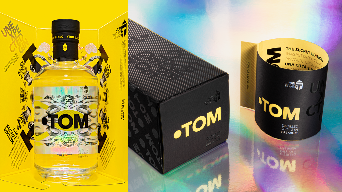
The elegant gift box features an unusual rip-strip opening which references the world of fashion. It opens to reveal a kaleidoscope of symbols and allegories which represent the secret side of Milan – the Milan of exclusive terraces, enchanted gardens and curiosities hidden behind the walls of historic palazzos; echoes of stories which blur the line between reality and legend.
The discovery experience continues with the outer bottle wrap with a second rip-strip opening. The wrap delays the presentation of the bottle and doubles as a brochure which provides deeper insight into the theme of the limited edition.
Once the wrap is removed the beautiful bottle is revealed. The shimmering holographic effect of the back label is amplified by the distortionary effect of the liquid. The central “O” of the TOM logo guides your gaze through the glass to the kaleidoscope of the back label – an effect which mimics peeping through a keyhole.
This process of slow revelation transforms the packaging into an object of design which is engaging, stimulating and entertaining.
The creative team consisted of Fabio Straface, Creative Director; Fiona Martin, Senior Designer; Camilla Temelini, Senior Account; Giorgia Corte, Head of Strategy; Matteo Annacondia, Head of Production.
We would like to take the opportunity to thank the following people for supporting us in our pursuit of excellence: Giordano Conca and Caterina Rossi of TOM GIN, Incubator Brand Revolution LAB, Grafical Printers, myCordenons and Luxoro.
Our winning design will be displayed at the Museum für Kommunikation in Berlin from 4 November 2023.